
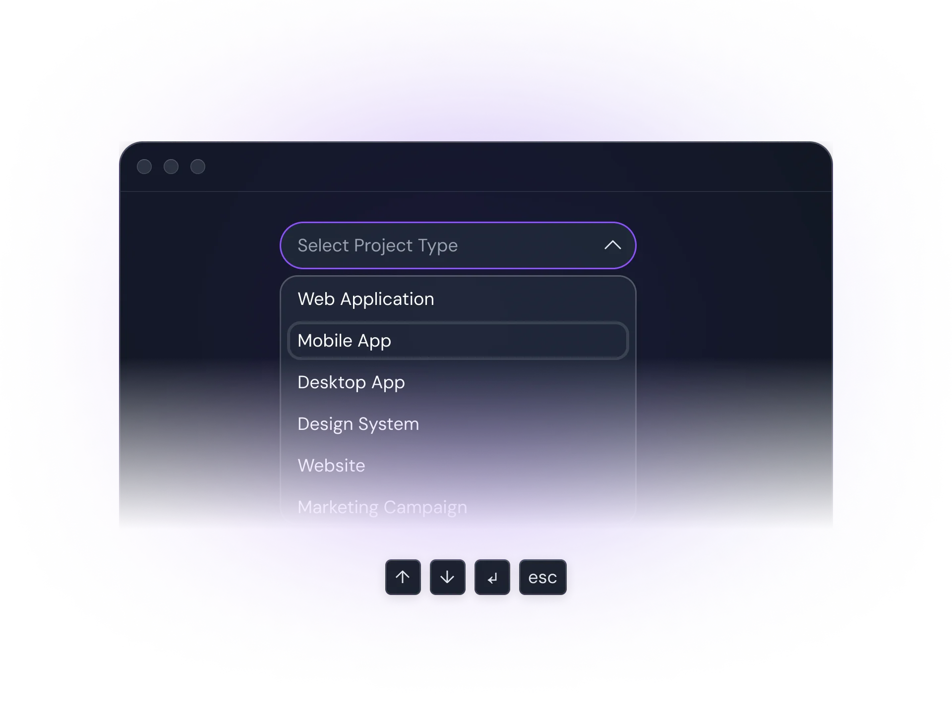
Build High-Impact UI with absolute parity
One cohesive React codebase. Leverage rigorous token system, instant multi-theming, and zero-runtime styling to build without compromise.


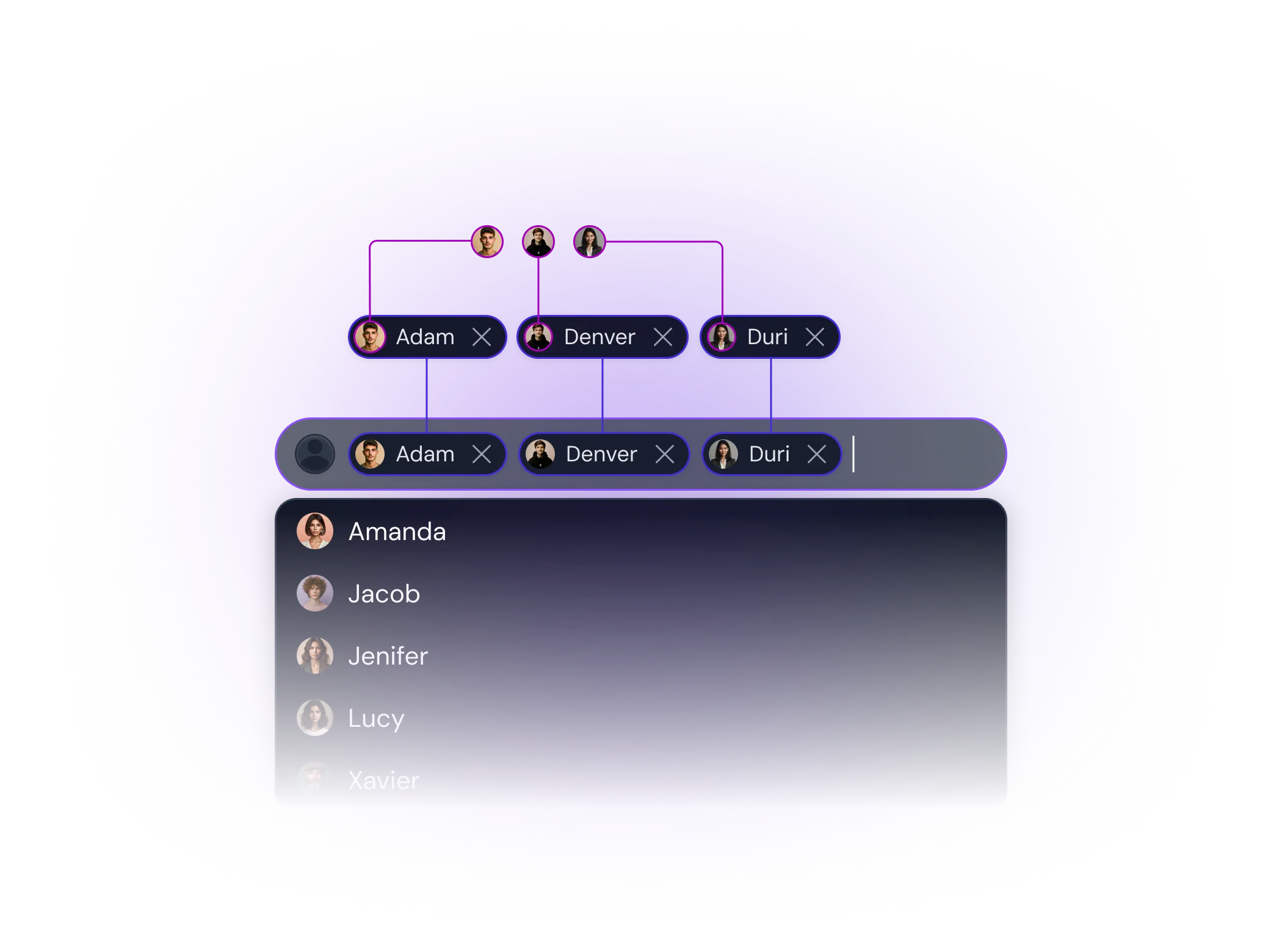
Create new team
Add users and start creating and managing your new team.

Message from Denver
You'll be leading the Project along with Amanda
15 mins ago
Deadline reminder
Deadline for your task is approaching. Ensure all material...
2 hrs ago
Task assigned
Denver has assigned you a task "Market Research"
8 hrs ago
Task overdue
Your task "Information Architecture" is overdue from 4...
1 day ago
Task approved
Deadline for your task is approaching. Ensure all materia...
2 days ago
 Tailwind CSS
 React Aria
Accessible out of the box
Powered by React Aria, Versa UI handles the hardest parts of accessibility so you don't have to.
Keyboard friendly
Smooth, native-feeling keyboard navigation for complex components like date pickers, modals, and dropdowns.
Screen reader ready
Built-in ARIA attributes ensure your interface is perfectly translated to assistive technologies without extra effort.
Smart focus management
Intelligent focus trapping keeps users from getting lost when navigating through overlapping menus or dialogs.
Multi-paradigm theming
Shift your product's entire visual language instantly. Drive multiple distinct aesthetics from the exact same React components.
Four distinct styles
Comes with Core, Brutalism, Humanist, and Glassmorphism aesthetics built right into the token architecture.
Seamless dark mode
Every single theme includes meticulously balanced light and dark mode tokens that switch flawlessly.
Effortless rebranding
Completely transform your UI's corners, shadows, and colors by simply swapping the active CSS variable file.
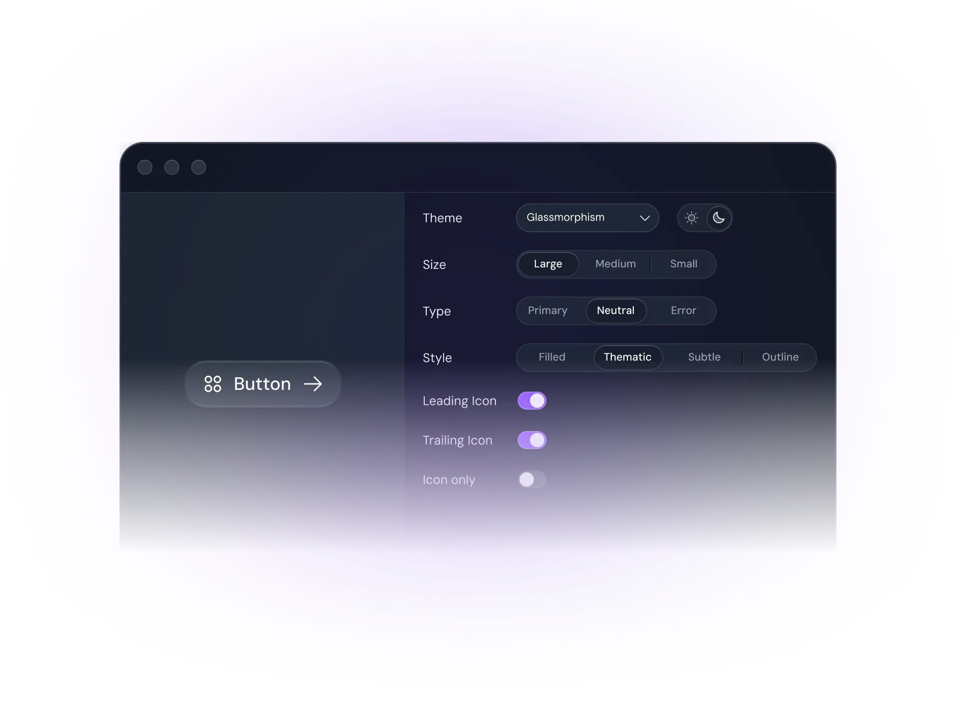
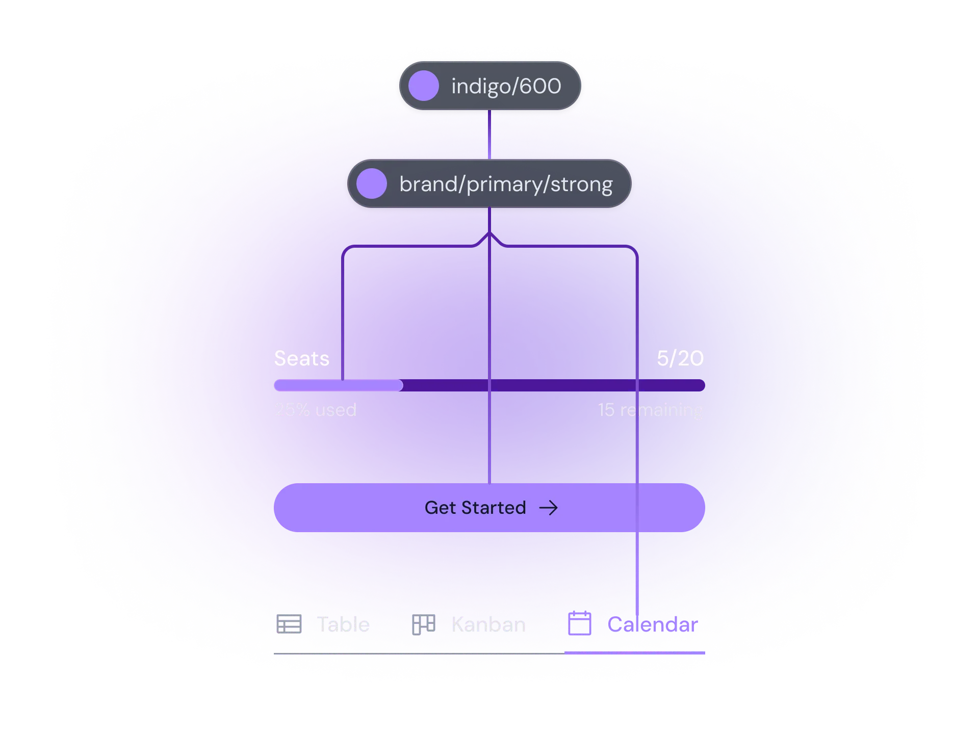
Rigorous token architecture
Every visual decision routes through a central, semantic token system.
Meaningful variables
Developers use logical names instead of random hex codes, making the code much easier to read.
Effortless global updates
Change your primary brand color in one single file, and watch it update safely across the entire application.
Bulletproof contrast
Token math ensures that your text and background color pairings always maintain accessible contrast ratios.
Composable Architecture
Combine primitive blocks into complex patterns. Scale effortlessly without creating fragile, one-off components.
Built for composition
Combine simple primitives to build highly complex, custom UI patterns on the fly.
Rapid extensibility
Snap together pre-tested, accessible primitives instead of building complex logic from scratch.
Eliminate UI bloat
Scale infinitely by reusing core blocks instead of cluttering your codebase with rigid, single-use components.
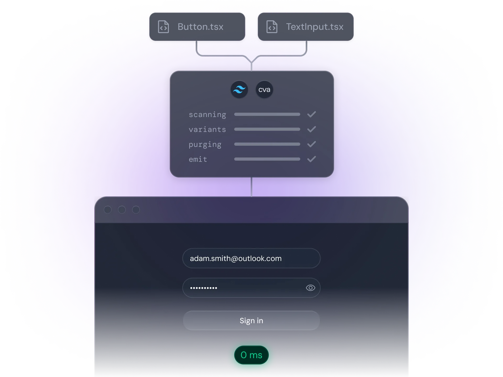
Zero-runtime styling
Built with Tailwind CSS and CVA, Versa UI generates static, utility-based styles that keep your application blazing fast.
Zero-runtime styling
No heavy CSS-in-JS libraries calculating styles on the fly, meaning your application’s initial load time is instant.
Server-side ready
Perfectly optimized for modern frameworks like Next.js Server Components, ensuring pages render before they even reach the user.
Clean component logic
Style variants are handled cleanly through utility classes, keeping your React files uncluttered and easy to maintain.
Components that go past the basics
Versa UI covers both core building blocks and complex interface patterns, designed to hold up in real product workflows.


Simple pricing for every builder
Versa UI is available as a one-time purchase.
No subscriptions, no hidden fees.
FAQs
Everything you need to know about Versa UI, from access and licensing to themes, components, and compatibility.
How is Versa UI React different from libraries like shadcn, MUI, or Chakra?
Does it support theming out of the box?
Are components accessible?
Can I customize components for my project?
Does it work with modern React setups like Next.js?


Scale Smarter.
Build Faster.
Ship Confidently.
Get access to a theme-flexible, production-grade UI system crafted for creators, designers, and builders.