From Basics to Brilliance
Versa UI includes an extensive collection of components, from essentials to advanced.
CORE COMPONENTS
Foundational UI elements built for flexibility and consistency.
Accordion
16 variants
Alert
20 variants
Avatar
3 components • 174 variants
Badge
12 variants
Breadcrumbs
2 components • 9 variants
Button
9 components • 473 variants
Button Group
2 components • 84 variants
Checkbox
3 components • 84 variants
Date Picker
2 components • 14 variants
Divider
2 components • 12 variants
Dropdown
5 components • 492 variants
Input Field
5 components • 224 variants
Logo
75 variants
Modal
4 components • 12 variants
Pagination
2 components • 5 variants
Progress Bar
7 components • 68 variants
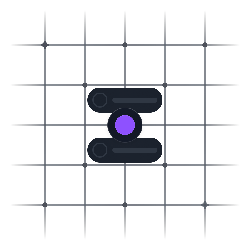
Radio
3 components • 36 variants
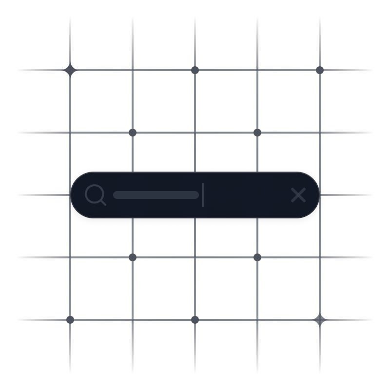
Search
18 variants
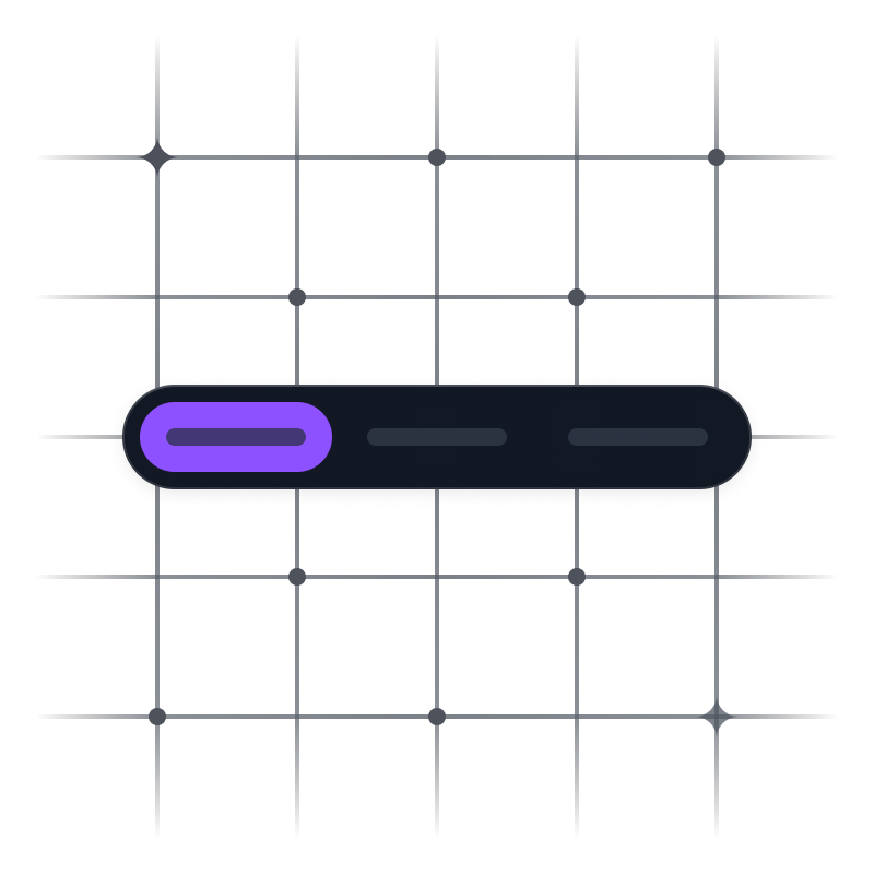
Segmented Control
2 components • 144 variants
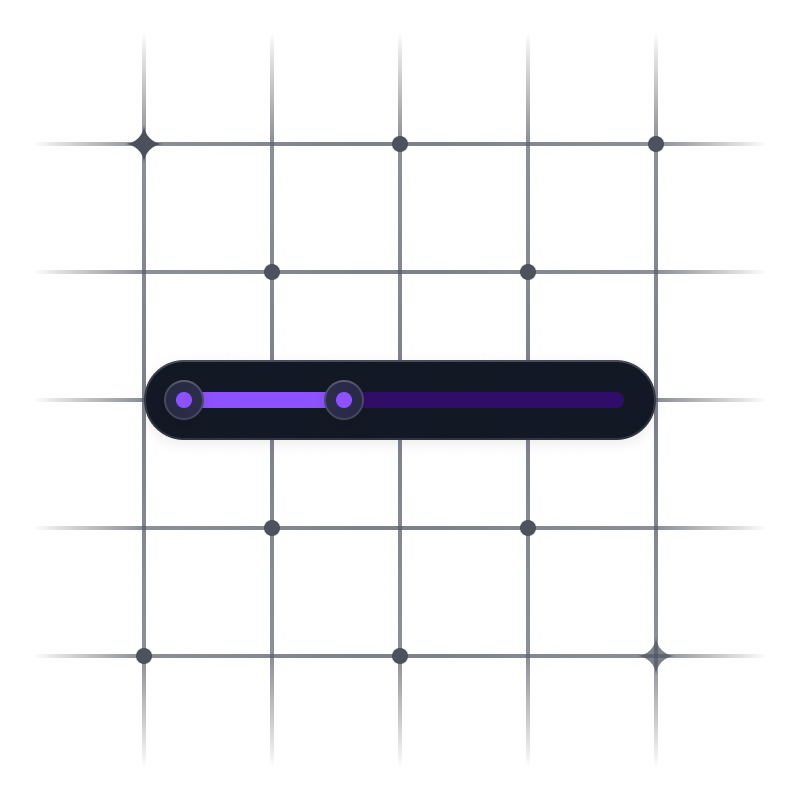
Slider
8 components • 180 variants
Step Indicator
6 components • 48 variants
Tabs
6 components • 90 variants
Tag
2 components • 110 variants
Toast
20 variants
Toggle
3 components • 60 variants
Tooltip
16 variants
APP COMPONENTS
Functional, scalable modules crafted for product and SaaS interfaces.
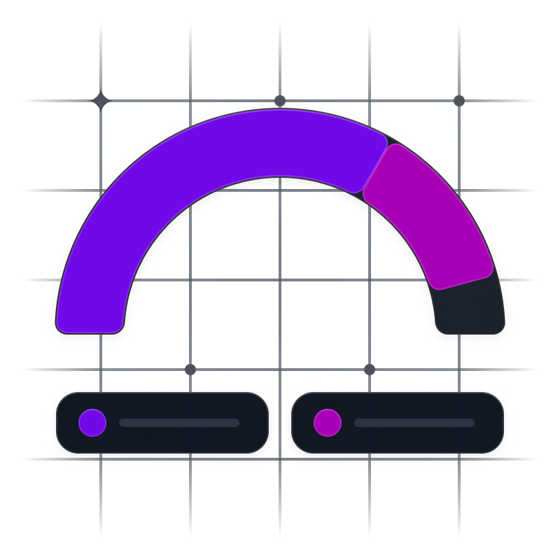
Charts
18 components • 126 variants
Chat
10 components • 69 variants
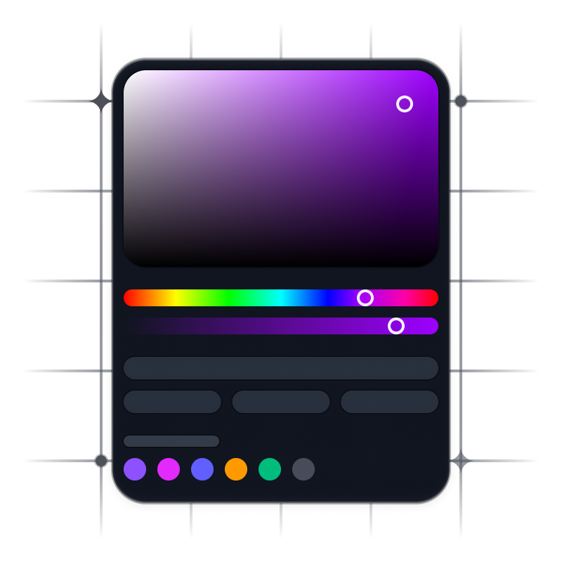
Color Picker
5 components • 31 variants
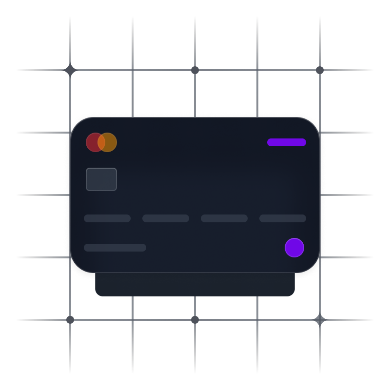
Credit Card
3 variants
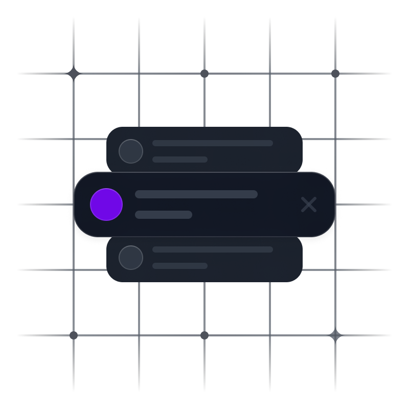
File Preview
18 variants
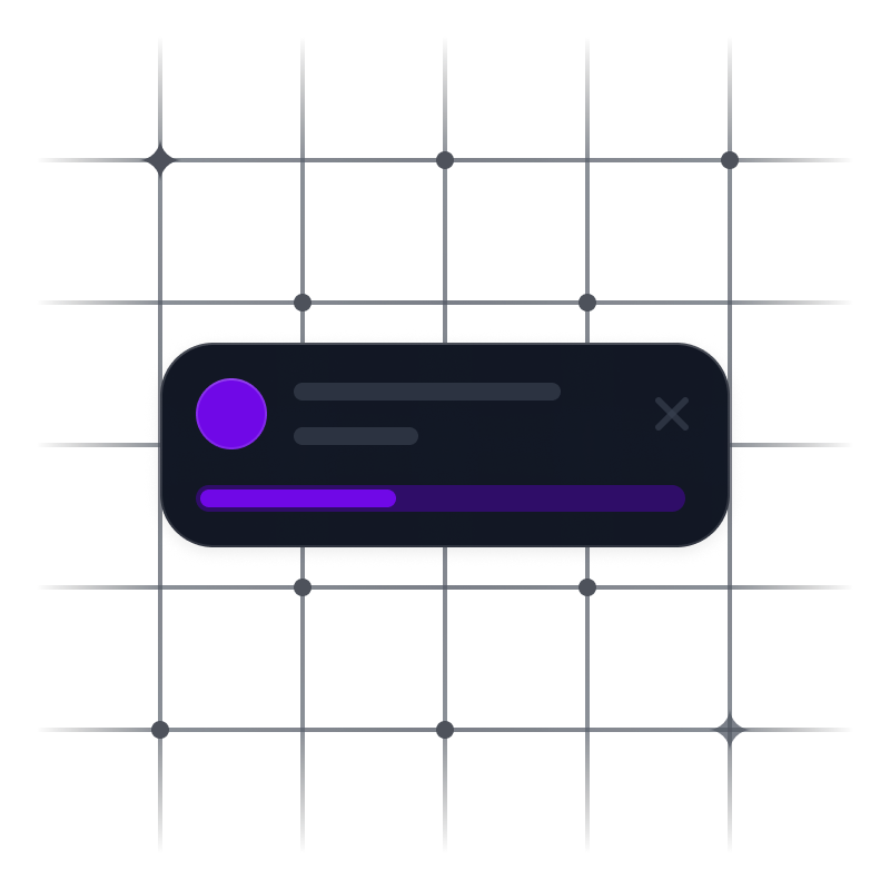
File Upload
3 components • 12 variants
Metrics
36 variants
Notification
2 components • 9 variants
Side Navigation
4 components • 30 variants
Table
5 components • 78 variants
![Top Navigation [App] preview](/assets/website/components/Top Navigation [App].png)
Top Navigation [App]
5 components • 16 variants
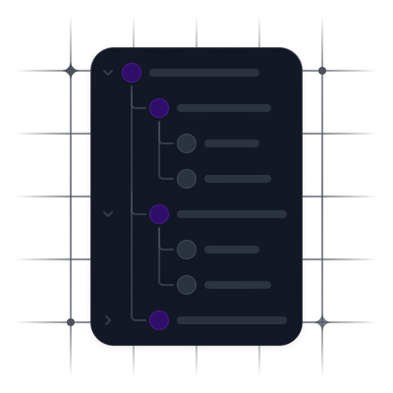
Tree View
2 components • 76 variants
WEBSITE COMPONENTS
Presentation-focused components designed for marketing pages.

![Top Navigation [Website] preview](/assets/website/components/Top Navigation [Website].png)

Scale Smarter.
Build Faster.
Ship Confidently.
Get access to a theme-flexible, production-grade UI system crafted for creators, designers, and builders.