The Ultimate Framework for complex products
A solid foundation with four complete themes, production-ready templates, comprehensive documentation and precisely structured variables.
From basics to brilliance
Every component is structured with scalable variants, smart nesting and theme-awareness for use across all design contexts.
Extensive variant support
Components come with all the interaction states with support for size and style variants.
Modular yet cohesive
Built using atomic principles, deeply nested but easily over-rideable.
Beyond basics
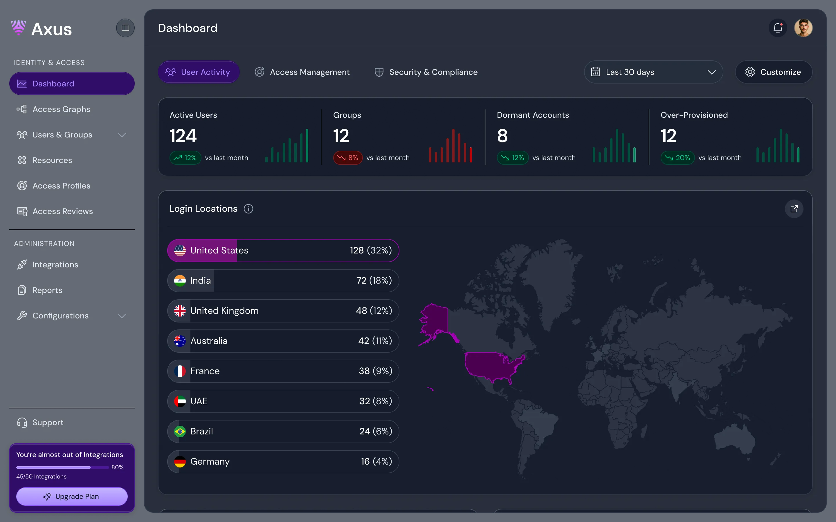
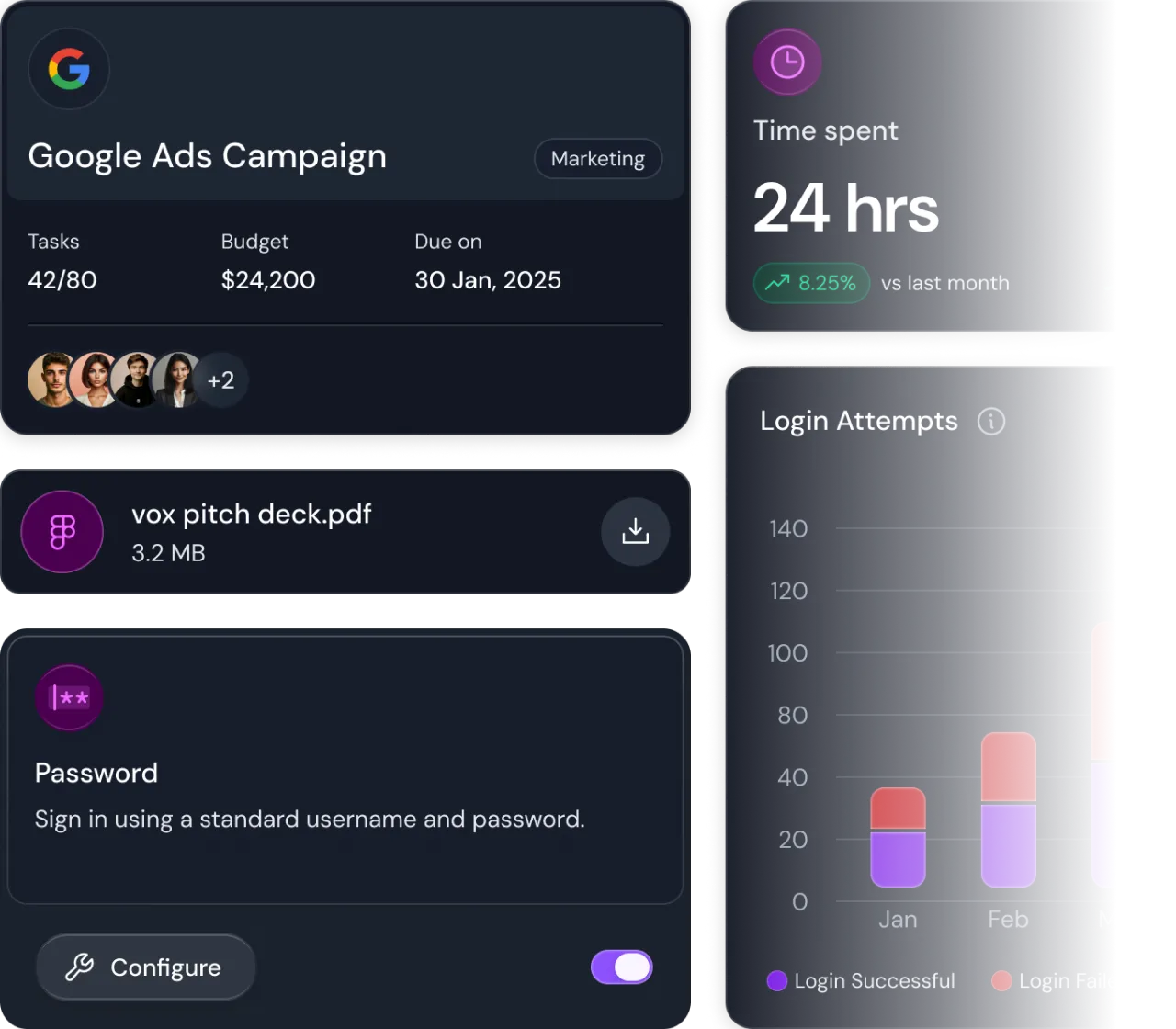
Includes high-utility product components like chat, tables, charts, tree view and more.
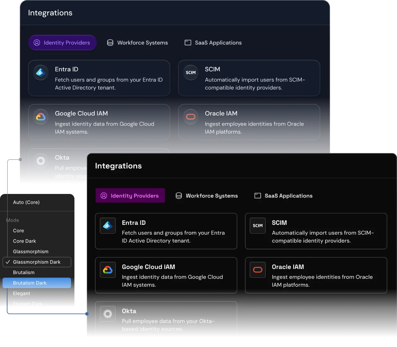
True multi-theme architecture
Versa comes with four meticulously crafted themes each built on a shared foundation, yet visually distinct.
4 distinct themes
From refined to bold, choose from Core, Glassmorphism, Brutalism, and Humanist styles.
Light & dark modes
Each theme includes seamless light and dark variations, all fully tokenized for instant switching.
Auto-adaptive styling
Styles and effects adapt automatically based on the selected theme and mode.
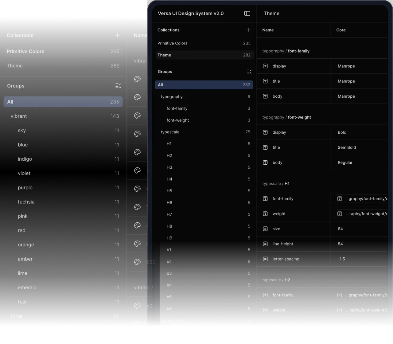
Tokens that do heavy lifting
Versa's style foundation is deeply tokenized allowing consistency at scale.
Color system that adapts
Includes primitive and semantic mappings with accessibility-checked contrast values.
Flexible typography tokens
Typographic system allows instant font and style updates across all themes.
Component-aware effects
Elevation, background blur, corner radius and other effects are tokenized and adapt per theme.
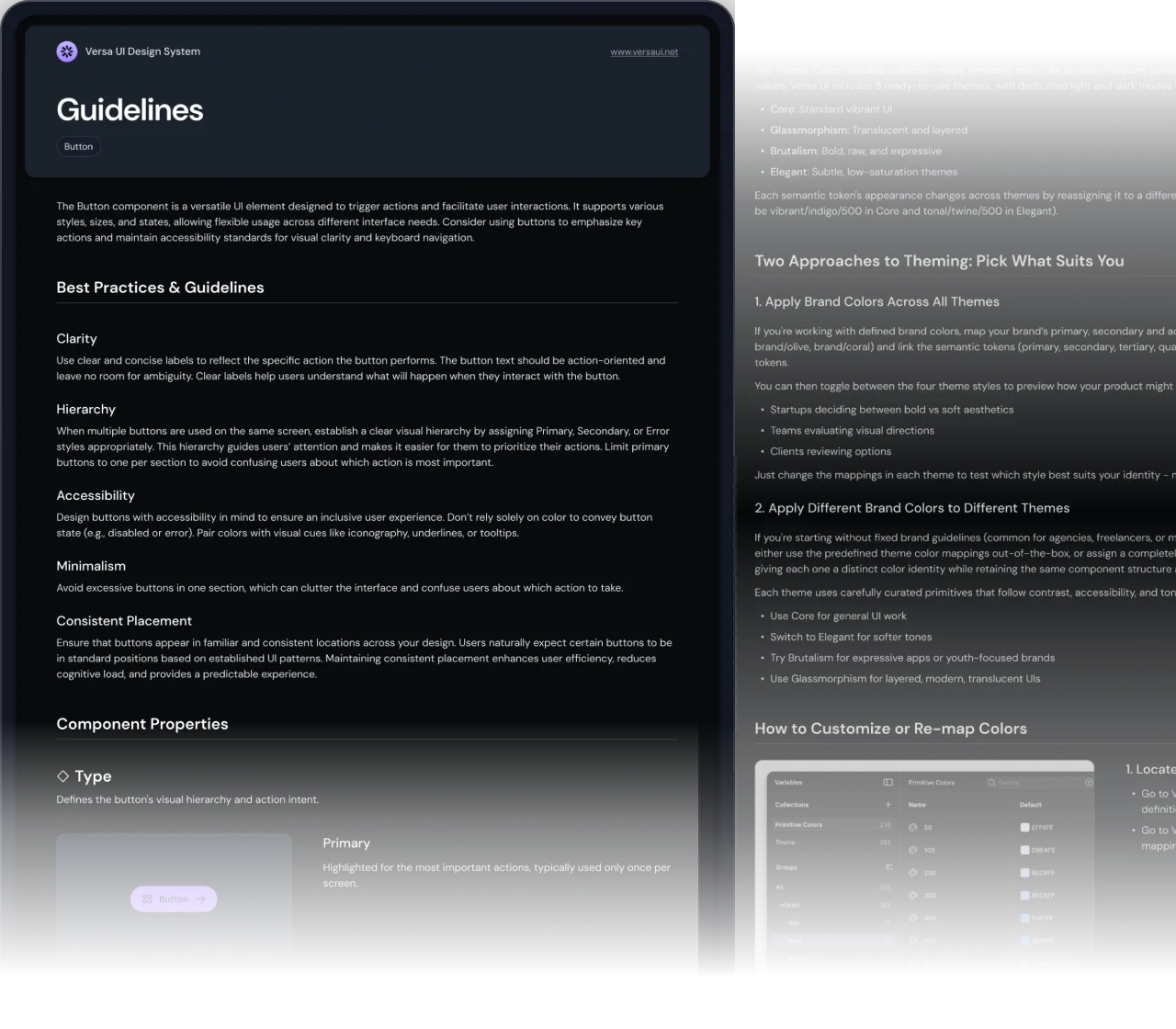
Comprehensive documentation
Versa UI ships with extensive documentation, eliminating guesswork and standardizing implementation.
Getting started guide
Step-wise explanation on how to start using the design system and adapt it inline to the project.
Foundation guides
Clear instructions on token management, variable setup, and publishing the library.
Component deep dives
Dedicated pages for core components explaining usage guidelines and properties.
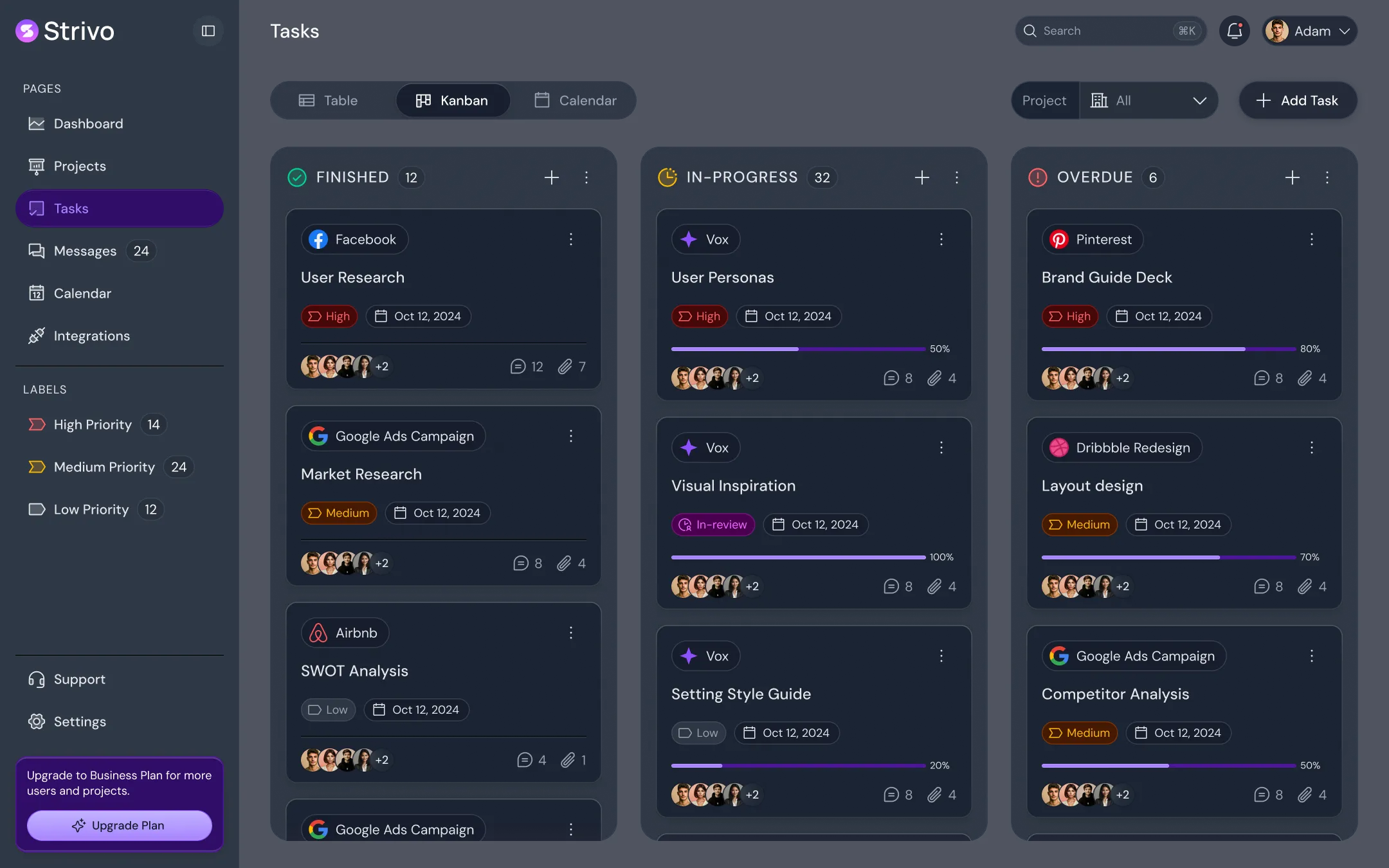
Kickstart with Complete UI Flows
Versa UI includes three production-ready flows. Each flow comes with thoughtfully designed screens, reusable components, and structured layouts.
One complete system
From tokens to full product flows, every part of Versa UI is designed to work together at scale.
1700+ Components
From form fields and buttons to charts, tables and more
4 Themes × 2 Modes
Instantly switch between Core, Glassmorphism, Brutalism, and Humanist - all in light & dark modes.
130+ Pages
Detailed UI flows to kickstart your builds with fully mapped, complex layouts.
400+ Smart Tokens
Style and effects variables cleanly divided into primitives and semantics.
9100+ Icons
Phosphor icon library with 6 weights and categorized popular brand icons.
20+ Adaptive Illustrations
Starter pack of theme-adaptive empty state illustrations for seamless onboarding.
Simple pricing for every creator
Versa UI is available as a one-time purchase.
No subscriptions, no hidden fees.
Questions?
We got Answers.
Everything you need to know about Versa UI, how it works, and how to get started.
Is this just a UI kit or a full design system?
How are tokens and styles managed?
Are the components flexible or rigid?
Do the templates reflect real product scenarios?
Can I use it for different types of products, not just SaaS?

Scale Smarter.
Build Faster.
Ship Confidently.
Get access to a theme-flexible, production-grade UI system crafted for creators, designers, and builders.